As a Rotessa Partner, displaying the Partner Badge on your website is a key part of the program. It helps showcase your connection to our community and lets your audience know you’re a proud Rotessa user. To keep everything looking great, we ask that you follow a few simple guidelines for placement, spacing, and color use. Whenever possible, we also ask that you link the badge to rotessa.com.
Show off your partner status – display your Rotessa Partner Badge on your website to highlight your role in our community.
If you have any questions, please reach out to [email protected].
Clear space and minimum size
Think of clear space as an invisible space around the badge artwork that protects its legibility. No visual elements should be placed inside of it. The margin should be equal to the height of the Rotessa “r” symbol. This rule applies to any logo variation.

The minimum size protects the clear legibility of our badge. The height of the badge should never be displayed under 20 pixels for digital (at 72dpi).
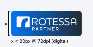
Logo variations
While the primary logo should always be your first option, the alternate variations can be used to fit different background colours. There has to be high contrast and the logo should always be perfectly legible. Below are approved background colours and logo combinations. Please note that the black and white logo options should only be used for print purposes and not for digital media.




What not to do
Don’t alter the Rotessa Partner logo in any way.
Below are some examples of what not to do with the Rotessa Partner logo.



Download logo kit
Click the download link below to download a ZIP file containing all of our logo variations. Please refer to the instructions above in your use of the logos.
